The 2026 World Cup is the first time in years that football kits feel BOLD again
For about a decade, international football kits have been stuck in a minimalism era. Plain templates. Tiny crests. Subdued colours. Brands kept making the same kit over and over again with different sponsor patches. The 2018 and 2022 World Cup cycles were full of perfectly fine, completely forgettable shirts.
2026 is different. The whole cycle feels alive. Brands are taking risks again. Heritage references are back. Colour is back. The trefoil is back. Every reveal week has produced kits that people actually wanted to argue about — which is the only meaningful test of whether a football kit cycle has worked.
Here are the seven design trends defining the 2026 cycle.
1. The trefoil comeback
The single biggest design move of the 2026 cycle. Adidas brought back the trefoil heritage logo on their international football kits for the first time in years, and it changed the entire feeling of the away kit collection. The trefoil signals heritage, terrace culture, throwback football authenticity — all the things the modern Adidas performance logo had been deliberately stripped of.
The result: Adidas's away collection (covered in our 2026 Adidas away kit ranking) felt more emotional than any cycle since the early 2010s. The trefoil isn't just a logo. It's a permission slip for the rest of the design team to be braver.
2. Retro-futurism in earnest
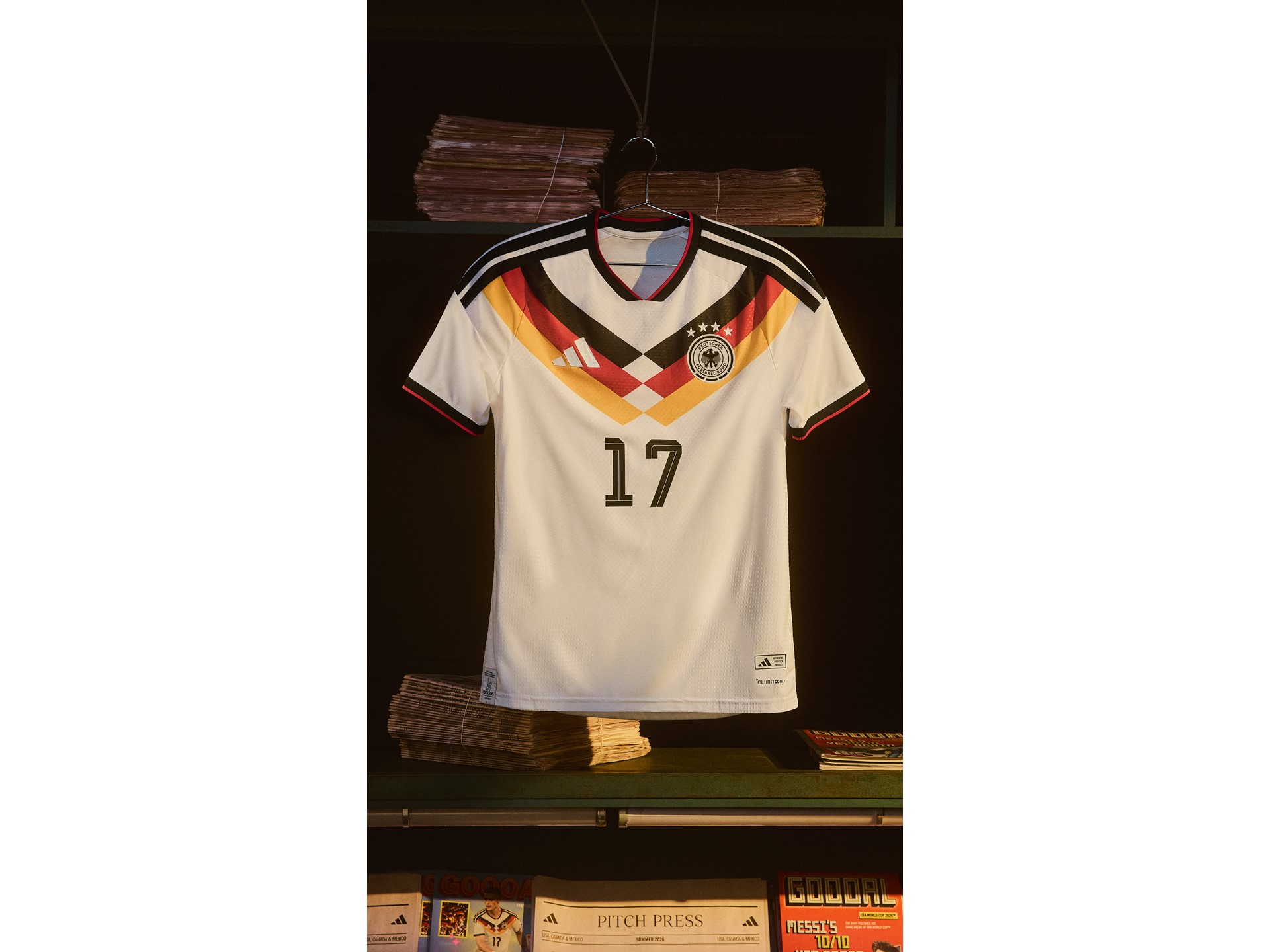
I wrote about this in the retro-futurism trends post in detail, but the short version is that 2026 kit designs are pulling from the late-90s and early-2000s era while updating the silhouettes and fabrics. Chunky collars are back. Geometric patterns are back. Late-90s panel-heavy shoulders are back. But the cuts are slimmer, the materials are technical, and the prints are more pixel-perfect.
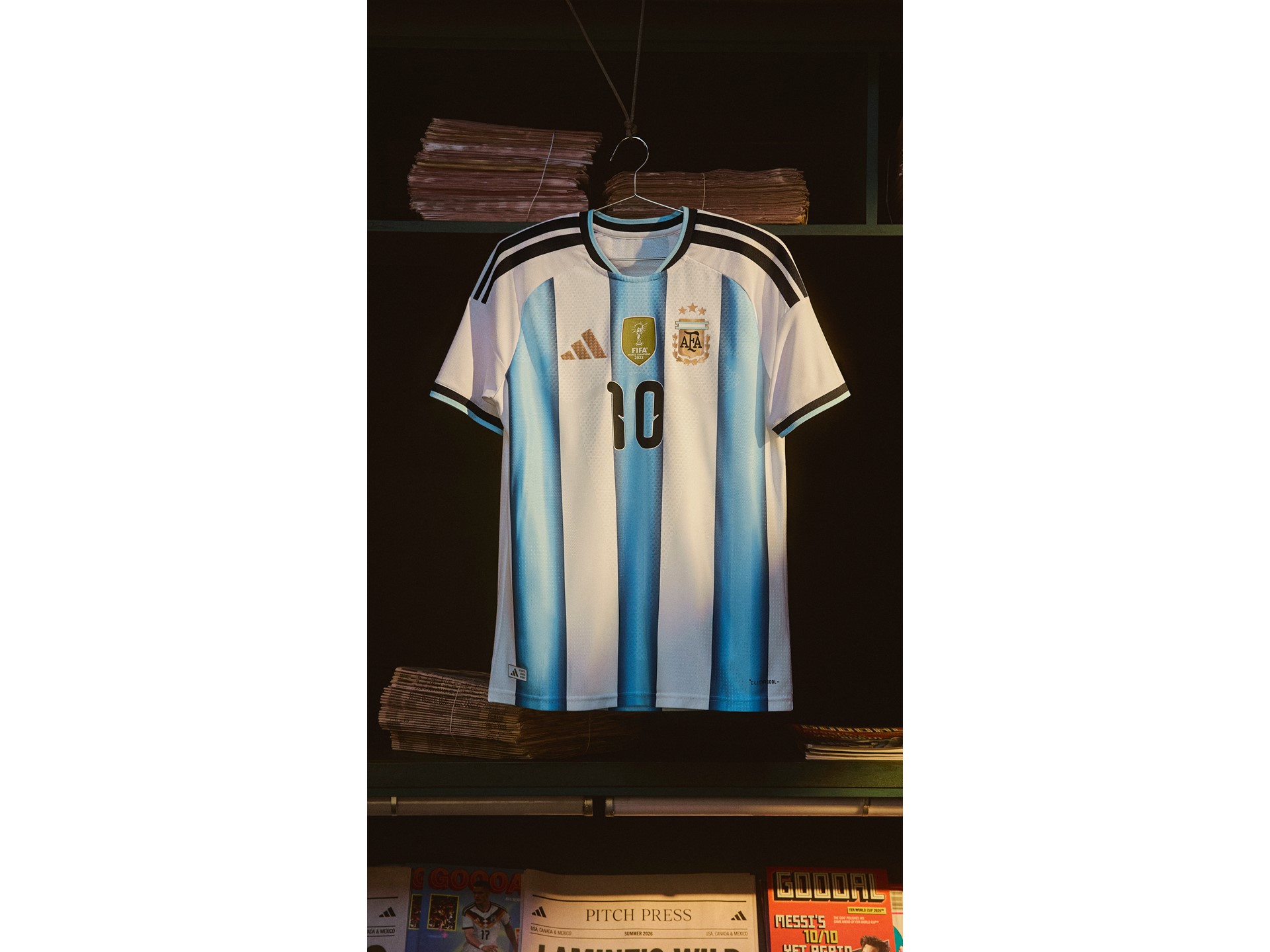
The result is shirts that feel familiar to anyone who watched France 98 or Brazil 2002, but look genuinely modern. Best of both worlds. The 2026 Argentina home and the Germany away are both prime examples of this trend done well.
3. Bold colour as a deliberate statement
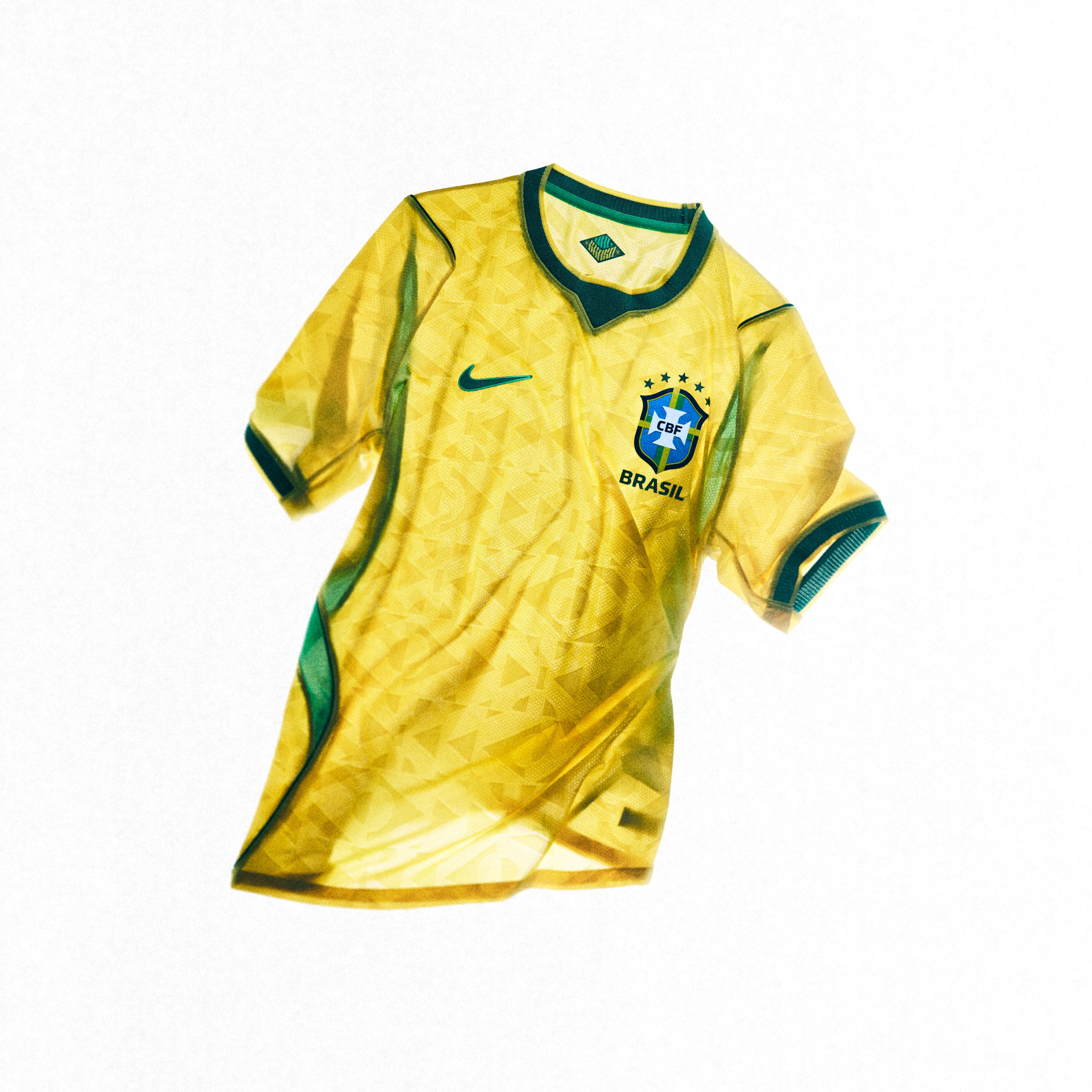
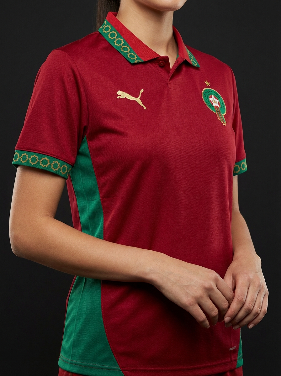
The post-2018 minimalism plague was partly about colour — designers leaning towards muted, "premium" tones rather than the vibrant primaries of the 90s. 2026 reverses that. Brazil's yellow is fully saturated. Morocco's red is almost neon. Mexico's green is brighter than any version since 1998.
The cycle is rejecting "tasteful" colour palettes in favour of unmistakable brand identity colours. See our best colour drop kits collection for the eight most-saturated kits of the cycle.
4. The fashion-collab era
Brazil x Jordan is the headline. But Brazil isn't the only collab — there are smaller fashion collaborations across the Adidas, Nike and Puma rosters that hint at where the brand strategy is going. Football kits are now too commercially significant to be left to the football design team alone. Brands are bringing in streetwear, lifestyle and high-fashion partners to make the shirts work as both performance kit and fashion item.
This is genuinely good for football culture. Football kits have always existed in a fashion context — it's why people wore them to school in the 90s and to clubs in the 2000s. The 2026 cycle is finally reflecting that in design intent.
5. Heritage crests over modern logos
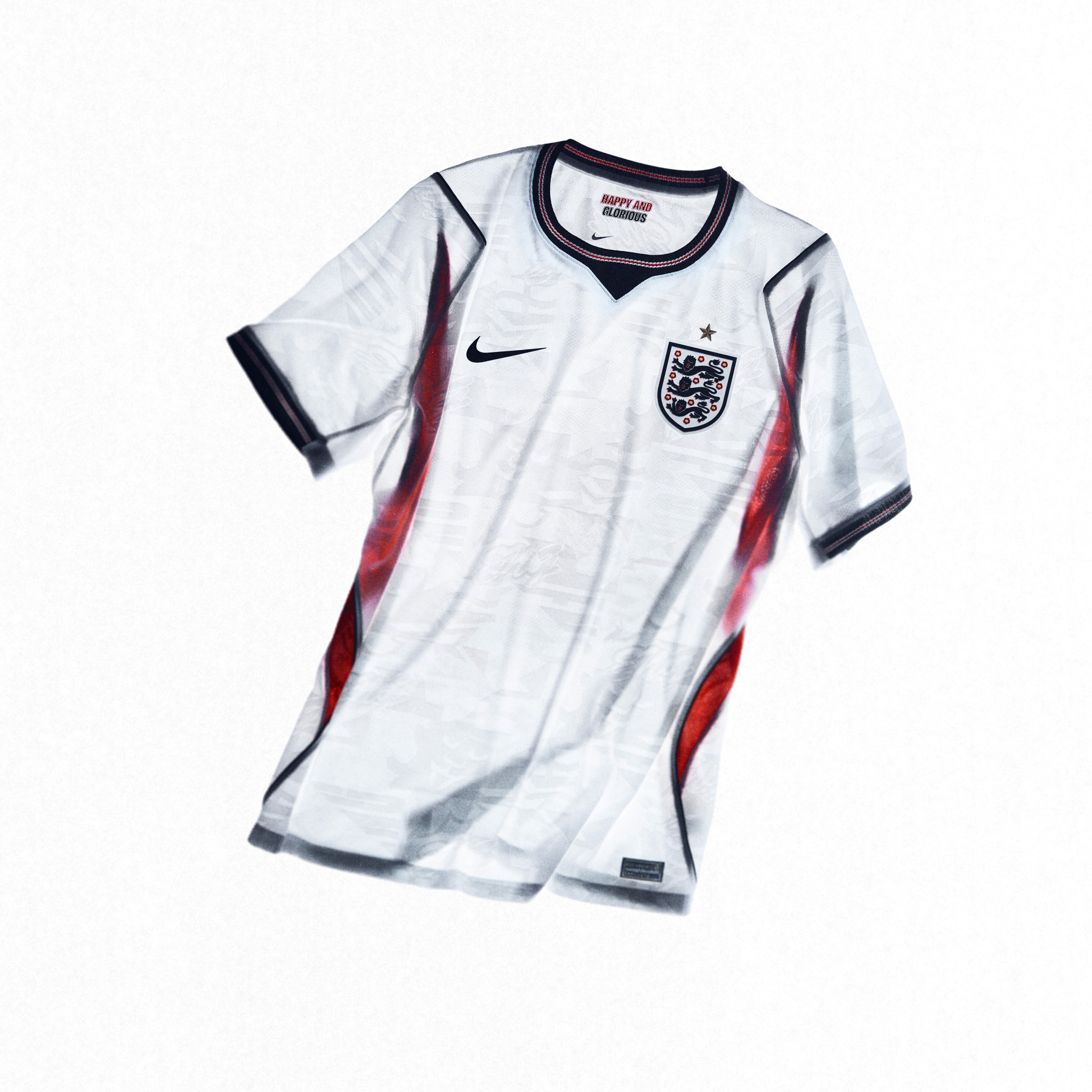
Multiple federations are reverting to older versions of their crests for 2026. This is the FA, the DFB, the AFA and the FIGC all looking at their history and deciding the older logo carries more weight than the modern rebrand. England's crest treatment in 2026 is leaner and more historic than the past two cycles. The visual cue says "this isn't new, this is forever".
The heritage crest move is a direct response to football fans pushing back on the corporate-rebrand era of the 2010s. Brands listened. Crests came home.
6. Material innovation that you can actually feel
The performance fabrics in 2026 player-version shirts are genuinely lighter and more breathable than 2022 equivalents. Nike Vaporknit, Adidas Heat.rdy, Puma Ultraweave — all three brands have shipped meaningful upgrades over the past 18 months. The shirts feel different in the hand, weigh less, and are noticeably better at temperature management.
For most fans this doesn't matter (you're not actually playing in your shirt). But for the player-version buyers and the kit obsessives, the material differences are real and worth the premium.
7. The shoulder stripe revival
Adidas leaned hard into making the three stripes obvious on the shoulder again in 2026 — the cleanest version of the brand's most famous design element. After years of subtle, minimal three-stripe placement, the 2026 cycle puts them back where they belong: bold, unmissable, on the shoulder. Nike followed with similar shoulder treatment on several federation kits. The shoulder stripe is the heritage detail that brands stopped thinking they needed and then realised they did.
What this means for buying
If you're shopping for a 2026 kit, the seven trends above should narrow your shortlist:
- Want the most heritage-feeling kit? Look at the Adidas trefoil away shirts.
- Want the loudest colour? Brazil, Morocco, Mexico or Netherlands.
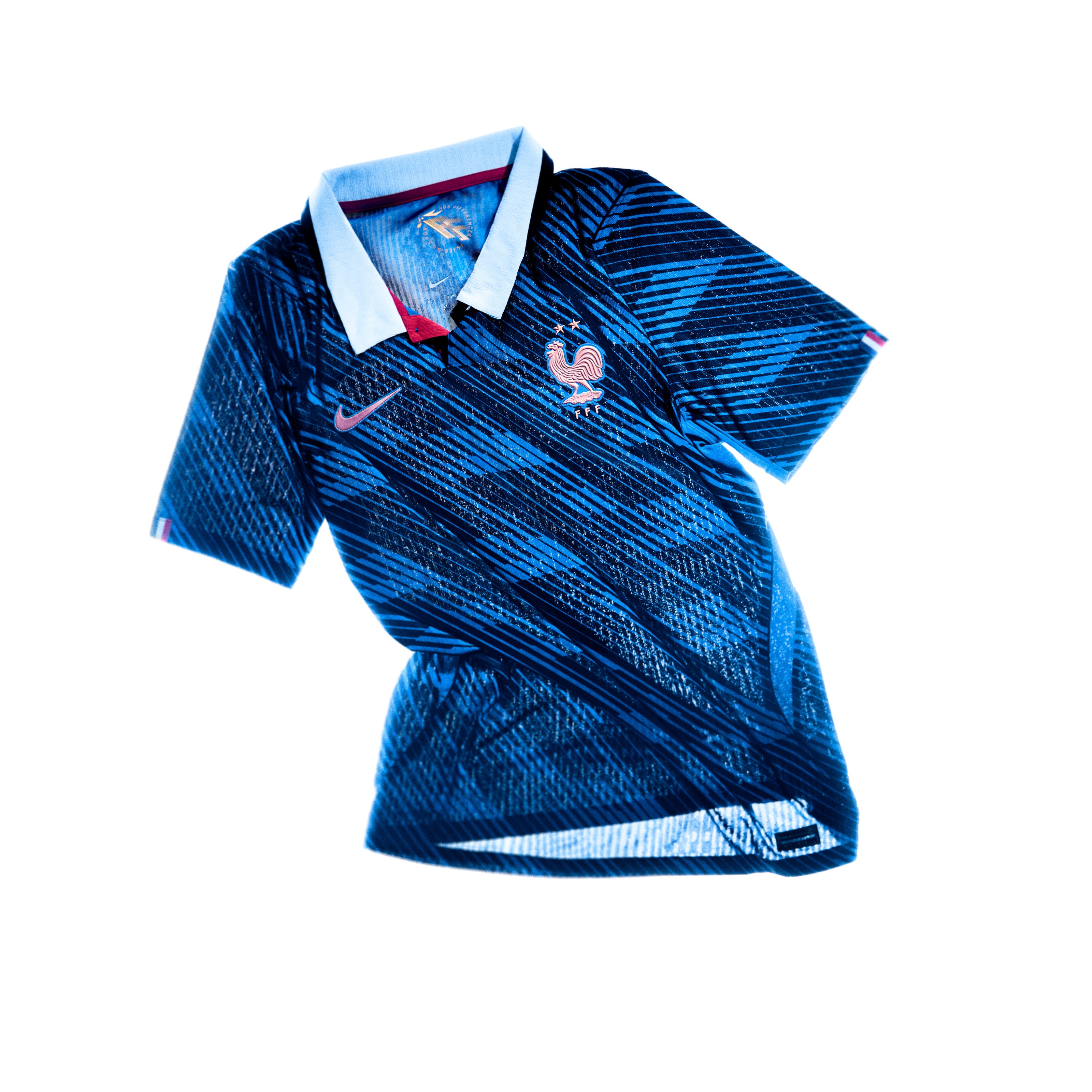
- Want fashion-crossover appeal? Brazil x Jordan, England, France.
- Want material innovation? Pay for the player version (Vaporknit/Heat.rdy/Ultraweave).
- Want a kit that aged-well 1990s feel? Argentina home or Germany away.
The full ranking by brand is in our Adidas vs Nike vs Puma final verdict. The 25 best ever (across all eras) are in the all-time best ranking.
2026 is the best kit cycle in years. Don't wait for the obvious shirts to sell out before deciding which one is yours.