🇺🇸 USA
Nike · Official
Google Analytics choice
GA4 loads only if you accept. Cookie-free Ahrefs Web Analytics runs independently. See our privacy policy. This choice does not manage advertising consent.
Head-to-head kit battle
Nike · Official
Nike · Official
⚡ Quick Verdict
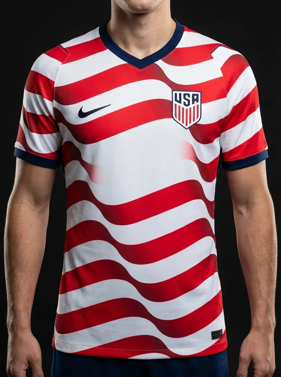
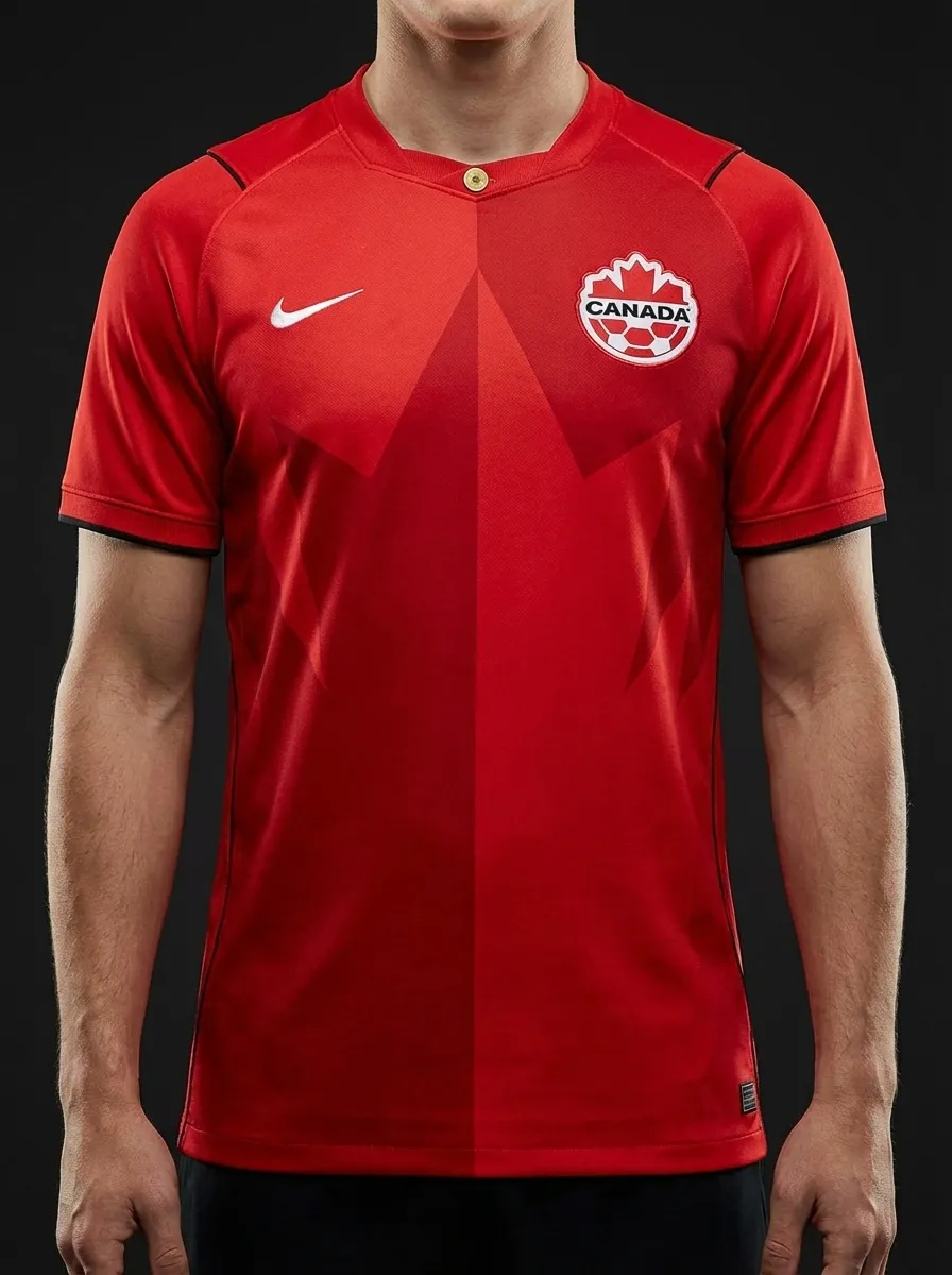
Two host nations and the same supplier make this a useful Nike comparison: USA in a navy-led home look and Canada in a bright maple-leaf red. The USA shirt feels more technical and muted, while Canada go straight at a simpler, clearer national identity.
With both nations helping host the 2026 tournament, USA versus Canada has more edge now than in earlier World Cup cycles.
Vote this matchup
Stored locally on this device.
Share this
Real team data pulled from the current 2026 dataset.
| Category | 🇺🇸 USA | 🇨🇦 Canada |
|---|---|---|
| Brand | Nike | Nike |
| Primary Colour | Navy | Red |
| Away Colour | White | White |
| Group | D | B |
| Kit Status | Official | Official |
| Star Players | Christian Pulisic, Weston McKennie, Tyler Adams | Alphonso Davies, Jonathan David, Stephen Eustaquio |
| Home Kit Notes | Modern navy-led home kit with red-and-white detailing and athletic edge. | Bold red shirt with clean white detailing built around the maple leaf identity. |
🏛️ Most Classic
Canada’s red-and-white identity reads more directly from the flag and feels more traditional.
Explore Canada's kit →🔥 Boldest Design
The red home shirt has more punch than the darker, lower-key USA navy design.
Explore Canada's kit →🌍 Best for Neutrals
USA’s navy shirt is easier for neutrals who want a cleaner, less overtly national colour palette.
Explore USA's kit →👕 Everyday Pick
The darker Nike execution makes the USA shirt a safer everyday purchase beyond the tournament.
Explore USA's kit →Continue the shirt debate
Load both national shirts into an editable comparison, or use the club finder and Premier League ranking to build the next shortlist from reviewed 2026-27 releases.
Keep comparing
🇺🇸 USA vs 🇲🇽 Mexico
The biggest CONCACAF fixture also gives you a brand contrast: Nike’s navy USA home against Adidas green Mexico. The host nation look is sleek and modern, while Mexico stay closer to classic national colours with a home shirt that reads instantly on screen.
🇺🇸 USA vs 🇵🇾 Paraguay
USA versus Paraguay gives you Nike navy against Adidas red-and-white, which is a nice split between modern understatement and a more old-school South American look. The USA shirt feels technical and host-ready, while Paraguay arrive with a bolder palette and more traditional contrast.
🇨🇦 Canada vs 🇶🇦 Qatar
Canada versus Qatar puts Nike bright red up against Adidas maroon, which makes for a neat same-family comparison with very different moods. Canada go direct and flag-first, while Qatar look darker, richer, and a bit more unusual in the 2026 field.
🇺🇸 USA vs 🇦🇺 Australia
USA against Australia compares two Nike approaches to national identity: navy-led restraint versus gold and green brightness. The USA shirt feels more urban and polished, while Australia lean straight into colour and make no effort to hide it.
🇨🇭 Switzerland vs 🇨🇦 Canada
Switzerland versus Canada is a red-on-red comparison that works because Puma and Nike land in completely different places. Switzerland go cleaner and more traditional with white support, while Canada push a bolder, flatter host-era red that feels more direct and youthful.
🇺🇸 USA vs 🇲🇽 Mexico
USA versus Mexico doubles as a host-nations supplier battle: Nike’s darker, sleeker approach against Adidas pushing straight into classic national colours. It is a useful snapshot of how the two giant brands express identity in completely different ways.