Retro-Futurism Is Running the 2026 World Cup Kit Chat, and Honestly It Slaps
If you have been even vaguely online during the build-up to the 2026 World Cup, you have probably seen the same thing happen over and over again: a new kit drops, everyone argues for six hours, then somebody says it looks like it came from both 1998 and 2098 at the same time. That is basically the whole retro-futurism trend in one sentence.
And no, this is not just football fashion people being dramatic for the sake of it. The retro-futurism thing is properly everywhere in 2026 World Cup kit design. Brands are mixing old-school badge placements, shiny trim, weird geometric fades, and throwback collar shapes with super-clean performance cuts and slightly sci-fi graphics. It is like kit designers found a stack of old VHS recordings of World Cups, watched a bunch of space films, then decided to cook.
As a football fan, I kind of get why it is happening. International kits have to do more than look decent on a hanger. They need to feel iconic instantly. Club kits can build a vibe over a season. World Cup kits get judged in seconds. So brands are reaching for nostalgia because everyone reacts to it, then smashing it into futuristic design because this tournament is supposed to feel massive, global, and new.
The result? Some kits look unreal. Some look like a glitchy PE top from an elite sports college on Mars. But either way, they are not boring, and that matters. If you want the safest possible template shirt, this is not your summer. If you want bold collars, metallic accents, pixel fades, rebooted 90s energy, and a bit of chaos, 2026 is delivering.
Why Retro-Futurism Fits the 2026 World Cup So Well
The 2026 World Cup already feels different. It is bigger, louder, more commercial, more online, and way more visual than older tournaments. Every reveal is a social media event now. A kit is not just for the pitch. It has to work in leaked mock-ups, launch videos, close-up detail shots, fit pics, fan edits, and those side-by-side comparison threads where everybody pretends they are a design expert.
That is exactly why retro-futurism makes sense. Nostalgia gives the shirt emotional weight. Futurism gives it speed. Put them together and you get a design that feels familiar enough to hit older fans and fresh enough to hook younger ones who mostly know classic shirts through compilations, resale pages, and TikTok edits.
It is also a cheat code for brands because international football is built on memory. People remember the shirt from a mad goal, a legendary upset, a giant collapse, or a player turning a match into their own personal edit. Designers know that. So when they reference old tournament vibes without just copying them, they make a kit feel important before a ball has even been kicked.
If you are tracking which drops are getting the strongest reaction, it is usually the ones balancing throwback cues with modern weirdness. That sweet spot is doing numbers. You can see similar ideas in our kit clash breakdowns, especially when two teams lean into different eras at the same tournament.
The Main Design Tricks Brands Keep Using
Reworked 90s and Early 2000s Silhouettes
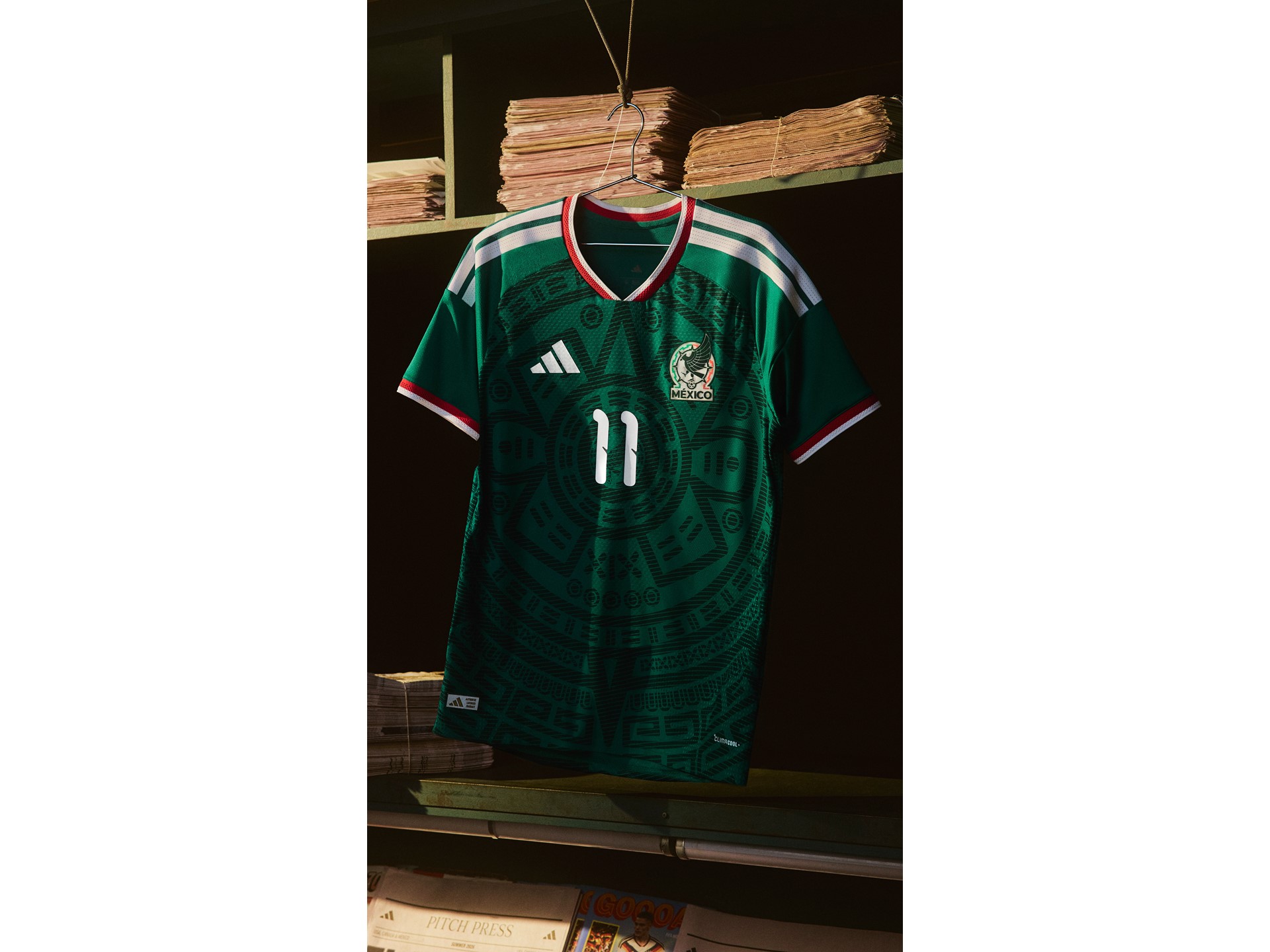
This is probably the clearest part of the trend. Brands are pulling details from the late 90s and early 2000s because those years were ridiculous in the best way. Chunkier collars, stronger sleeve trim, panel-heavy shoulders, central detailing, and visible structure are back. Not exactly back, though. More like remixed.
Instead of making kits baggy and heavy like the originals, designers are slimming the fit and sharpening the lines. So you still get that nostalgic frame around the shirt, but the body of it looks cleaner and more technical. It feels like the memory of a classic kit after somebody upgraded the graphics.
Metallics, Chrome Tones, and Reflective Trim
This is the bit that makes the shirts feel futuristic without turning them into full science-fiction cosplay. Tiny silver details, glossy overlays, iridescent badge outlines, and shiny numbering styles are being used to make kits look more advanced. Sometimes it is subtle. Sometimes it looks like the shirt belongs in a concept car reveal.
When it works, it is quality. It gives the kit energy under stadium lights and makes close-up shots pop. When it does not work, it can look a bit too try-hard. There is a thin line between premium and tacky, and a few brands are absolutely dribbling straight at that line.
Pixel Fades and Digital-Era Graphics
A lot of 2026 World Cup shirts are using patterns that feel digital rather than organic. Think pixel transitions, coded textures, fractured gradients, grid-based shadowing, and layered motifs that look like they were built from scan lines. It is basically the visual language of old gaming menus meeting modern sportswear.
This works brilliantly with retro inspiration because it references the era when football gaming, satellite TV graphics, and World Cup branding all started feeling hyper-designed. It is nostalgic, but not in a sepia-filter way. More like memory through a screen.
If you are comparing which brands are doing this best, our brand battle pages make it pretty obvious which manufacturers understand detail and which ones are just chucking effects at fabric.
Heritage Crests with Modern Framing
Another big move is treating the crest like the emotional anchor, then building futuristic elements around it. Some kits are using heritage-inspired badge shapes, cleaner embroidery styles, or simplified placement that feels more classic. Around that, they add contemporary pattern work, unusual trim colours, or modern type choices.
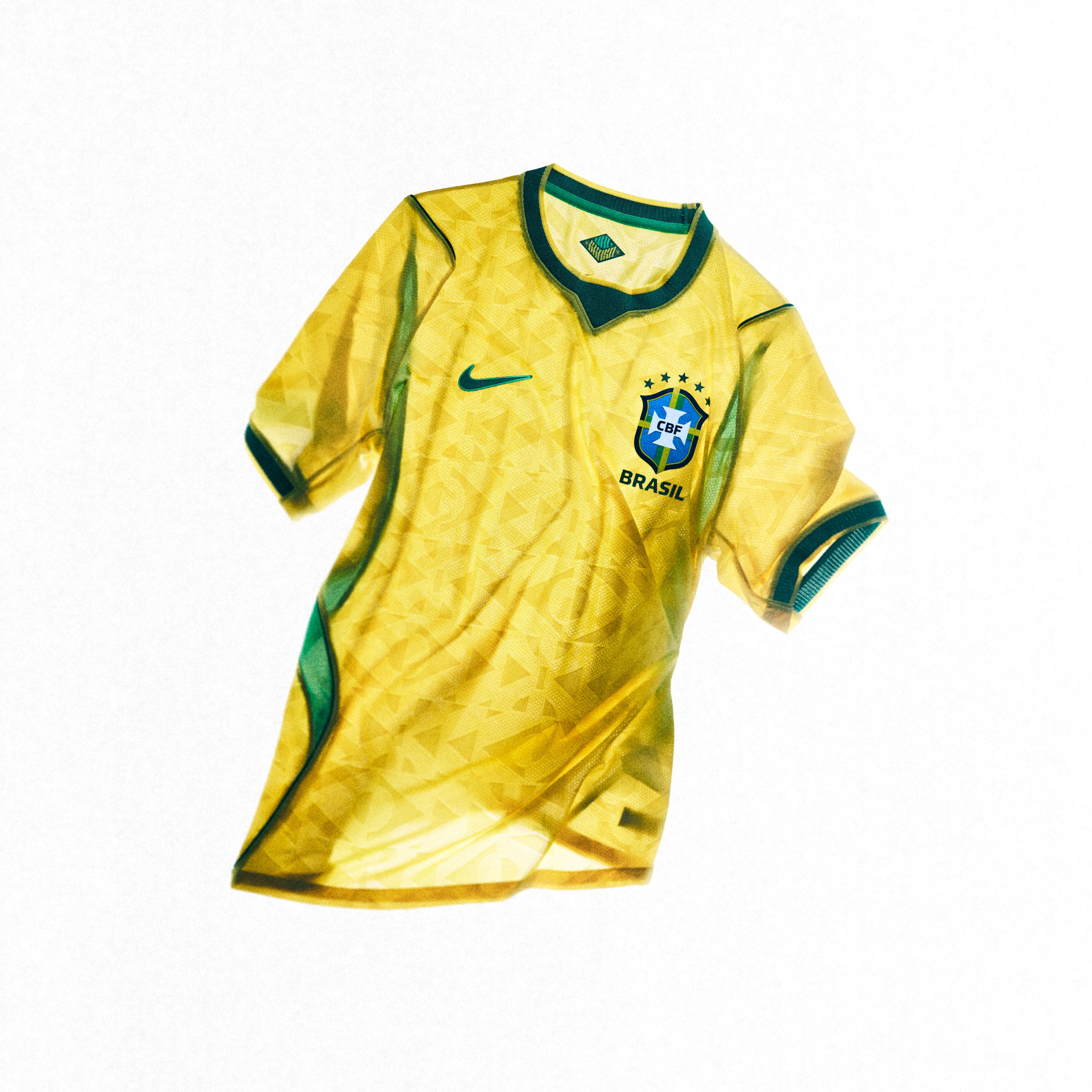
That combo is smart because the crest keeps the shirt grounded. You can make the rest of the design a bit weird as long as the badge still says, right, this is the nation, this is the identity, calm down. You can see this playing out in very different ways when you compare the Brazil and England drops — both badge-first philosophies, completely different executions.
Why Fans Are Actually Buying Into It
Normally, football fans say they want bold kits, then complain the second a brand does something bold. That still happens, obviously. Football discourse without outrage would collapse in minutes. But retro-futurism is landing better than most trends because it gives people two entry points.
Older fans can say, this reminds me of that one tournament shirt I loved. Younger fans can say, this looks hard and different from the dead template stuff we see every season. Both reactions can be true at once. That is rare.
There is also the fact that football shirts are just bigger in fashion now. Loads of people wear kits casually, not just to matches or five-a-side. So a World Cup shirt has to work as a piece of style as much as a sports uniform. Retro-futurism helps because it feels deliberate. It says this is not just another training-top-looking template with a flag slapped on.
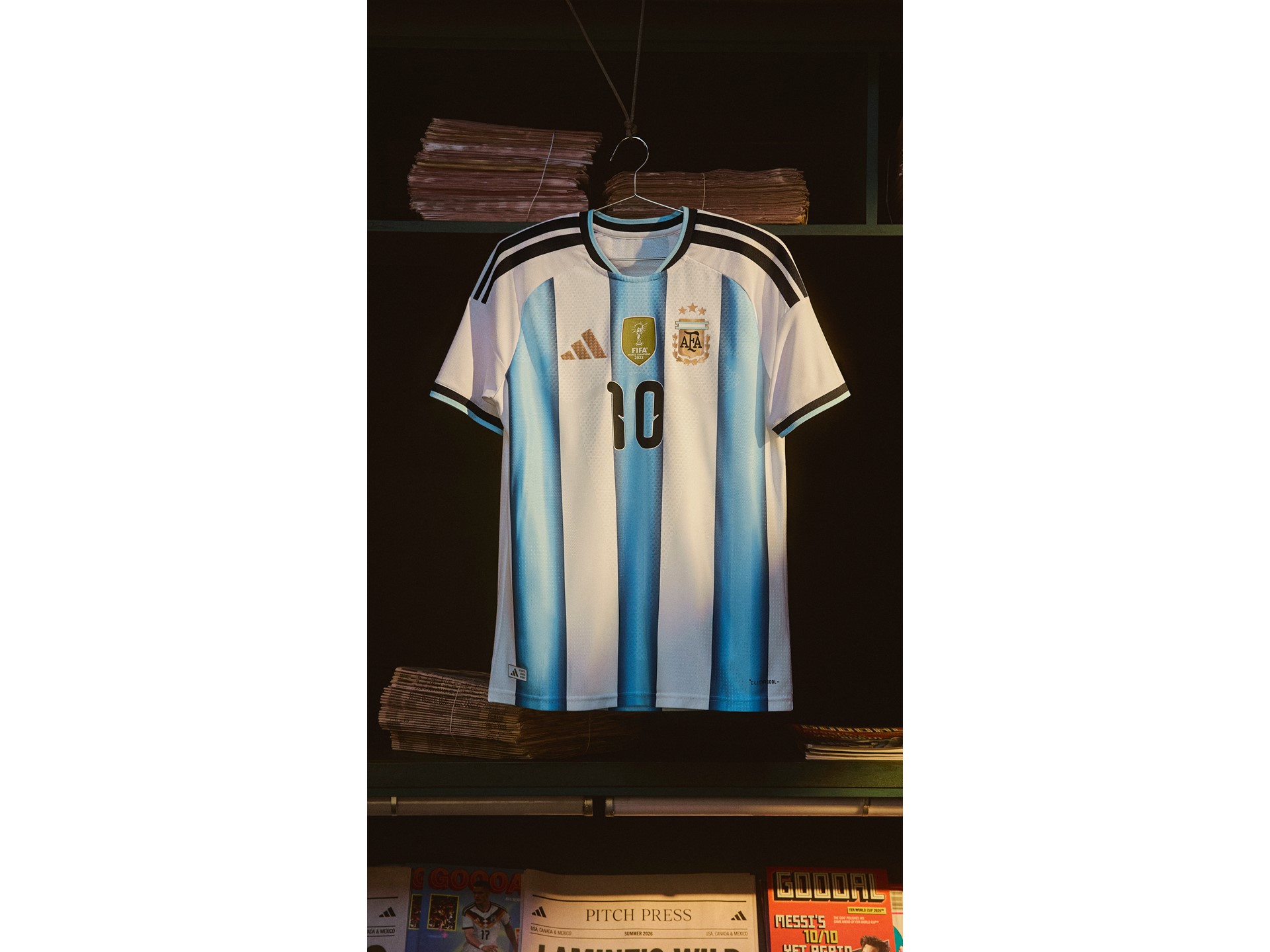
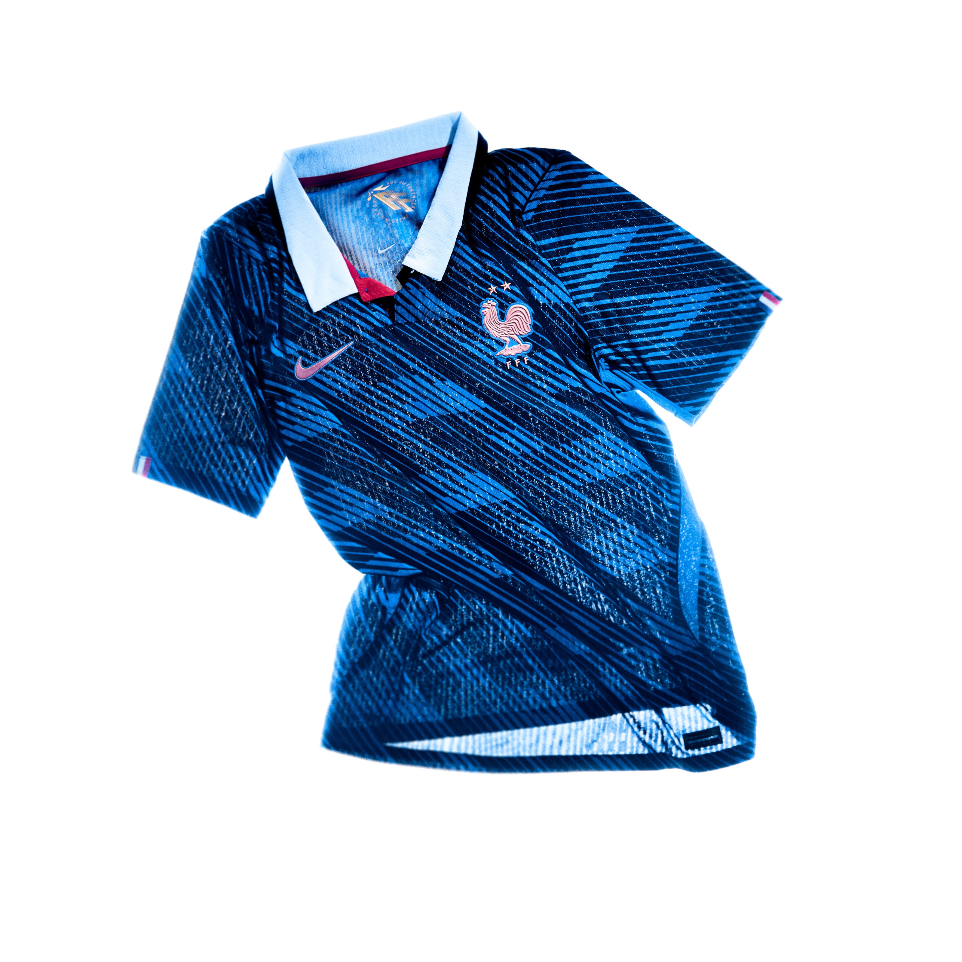
And if you are following releases closely, a proper kit tracker is basically essential this year because so many drops are trying some variation of the same idea. The details matter more than ever. When Argentina and France are both pulling from similar retro-futurist playbooks, the differences come down to execution — and execution is everything.
The Risk: Not Every Brand Understands the Assignment
Here is the problem. Retro-futurism sounds cool, but it is easy to mess up. Some brands hear retro and just copy an old shirt badly. Others hear future and make something that looks like an esports warm-up top. The best designs understand tension. They know the old and new parts should challenge each other a bit.
If a kit leans too retro, it can feel lazy. Like a reissue pretending to be a tournament shirt. If it leans too futuristic, it can lose the emotional pull that makes international kits special in the first place. The ideal balance is where you notice the throwback first, then keep spotting modern details the longer you stare at it.
It is a bit like squad building, honestly. You cannot just have nostalgia merchants and chaos merchants. You need structure. You need chemistry. You need someone in the room making sure the whole thing does not become nonsense. Check the Adidas vs Nike head-to-head to see who is actually winning the design war versus just the attention war.
What This Trend Says About Football Culture in 2026
The retro-futurism wave is not only about aesthetics. It says a lot about how football sees itself right now. The game is obsessed with history, but it is also addicted to constant reinvention. Clubs rebrand, tournaments expand, launches become multimedia campaigns, and fans experience everything through highlights, rumours, leaks, edits, and reaction posts.
So of course the kits look like the past and future at once. That is literally how the sport feels in 2026. Every new thing has to reference something old. Every old thing gets repackaged for a new audience. Some people hate that, but honestly, that tension is part of what makes football culture so addictive.
Also, let us be real: World Cup kits are supposed to feel a bit dramatic. This is not the place for timid design. It is the biggest stage in football. If there was ever a moment for a shirt to look like it belongs in a museum and a spaceship at the same time, this is it.
Will Retro-Futurism Age Well?
This is the real test. Some trends look amazing in the reveal and embarrassing a year later. I think the better 2026 World Cup kits will age properly well because they are not just chasing novelty. The strongest ones are anchored in familiar shapes, national identity, and proper tournament nostalgia. The futuristic bits are there to sharpen the story, not replace it.
That matters. The shirts people remember are not always the most beautiful in a pure design sense. They are the ones that capture a mood. If retro-futurism becomes the visual identity of this World Cup, then even the slightly mad shirts could become classics through association. One scream-worthy goal, one all-time upset, one iconic celebration, and suddenly the shirt is immortal.
If you want a better sense of how this stuff gets judged, our guide to how we rate and format kit reviews breaks down why some designs survive the hype cycle and others get cooked immediately.
The Best Part of the Trend? It Actually Feels Fun
That is probably why I rate this whole movement more than the usual minimal redesign stuff. Retro-futurism gives kit design permission to have a personality again. It does not have to be tasteful in that super safe, luxury-brand way. It can be loud. It can be glossy. It can reference old tournament madness while still looking made for the modern game.
And football should be allowed to look fun. Not every shirt needs to be a museum-grade minimalist object with a beige launch video and a sentence about craftsmanship. Sometimes you want a kit that looks like it could be worn by a generational winger in a quarter-final and by some bloke on a summer night arguing about full-backs outside the chippy.
The 2026 World Cup kit cycle is shaping up exactly like that. Messy at times, overdesigned in places, but memorable. And honestly, memorable beats safe every single time.
Ready to shop the trend? Browse the full range of 2026 World Cup kits on Amazon — home shirts, away drops, and retro reissues everyone is fighting over.
Frequently Asked Questions
What does retro-futurism mean in football kit design?
Retro-futurism in football kits means combining throwback design elements — like 90s collars, heritage crest shapes, and old-school trim — with modern tech such as metallic accents, digital patterns, and performance fabrics. The result feels familiar and futuristic at the same time.
Why are 2026 World Cup kits following the retro-futurism trend?
Brands need kits to feel instantly iconic. Retro elements trigger nostalgia and emotional connection; futuristic touches signal premium quality and modernity. On the biggest tournament stage, that combination is more powerful than safe minimalism when a kit has to land in seconds on social media.
Which brands are doing retro-futurism best at the 2026 World Cup?
Adidas are leaning hardest into heritage with the trefoil comeback. Nike are playing a clever modern-classic game. Puma are the wildcard, taking bigger creative swings that polarise opinion. Head to our brand battle page to vote with your own eyes and see who is actually ahead.
Will retro-futurist World Cup kits still look good in five years?
The strongest ones will. Kits anchored in national identity and real tournament nostalgia tend to age well because the futuristic elements sharpen the story without replacing the emotional core. And if a shirt gets attached to a memorable moment — one iconic goal, one massive upset — it becomes a classic regardless of trend.
What 90s design elements are coming back in 2026 World Cup kits?
Chunkier collars, strong sleeve trim, panel-heavy shoulders, central chest detailing, geometric fade patterns, and heritage logo placements are the main 90s influences in 2026 kits. They are remixed into modern slim cuts rather than reproduced exactly, which is what makes the trend actually work rather than feel like a lazy reissue.
Where can I buy official 2026 World Cup kits?
Official 2026 World Cup kits are available through major retailers. Amazon has a wide selection of international shirts with fast delivery. Check our kit tracker for the latest drops and availability updates as the tournament gets closer.