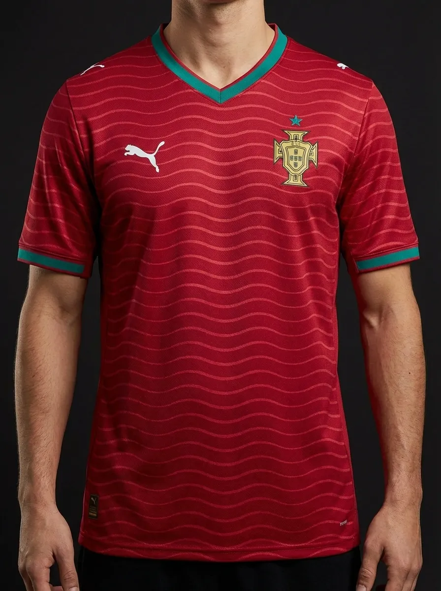
🇵🇹 Portugal
Puma
Head-to-head kit battle
Puma
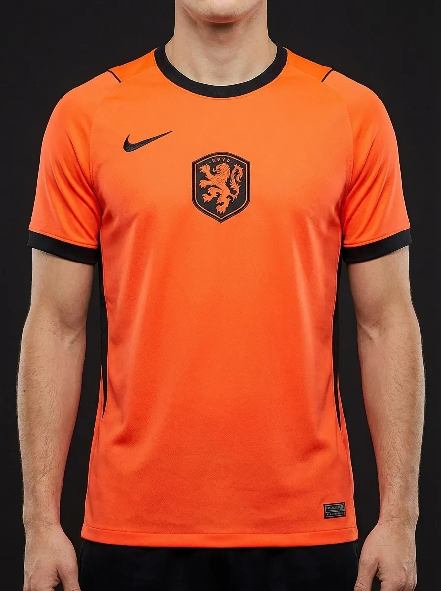
Nike
⚡ Quick Verdict
Portugal and the Netherlands give Nike a strong colour-against-colour battle: deep Portugal red and green versus the unmistakable Dutch orange. Portugal feel premium and modern, while the Netherlands rely on one of football’s boldest single-colour identities.
From the Battle of Nuremberg in 2006 to repeated tournament clashes, this matchup usually carries far more tension than a friendly on paper.
Vote this matchup
Stored locally on this device.
Share this
Real team data pulled from the current 2026 dataset.
| Category | 🇵🇹 Portugal | 🇳🇱 Netherlands |
|---|---|---|
| Brand | Puma | Nike |
| Primary Colour | Red | Orange |
| Away Colour | Green | Dark |
| Group | K | F |
| Kit Status | Confirmed | Confirmed |
| Star Players | Cristiano Ronaldo, Bruno Fernandes, Rafael Leao | Virgil van Dijk, Xavi Simons, Cody Gakpo |
| Home Kit Notes | Classic Portugal red with green trim and a premium modern cut. | Electric orange home shirt that feels unmistakably Dutch. |
🏛️ Most Classic
The Dutch orange home shirt is one of the game’s purest national identities and barely needs embellishment.
Explore Netherlands's kit →🔥 Boldest Design
Orange wins this category almost by default because few shirts in world football are this saturated or instantly recognisable.
Explore Netherlands's kit →🌍 Best for Neutrals
Portugal’s darker red base is easier for neutral fans to wear regularly without losing top-tier status.
Explore Portugal's kit →🛒 Best Buy
Portugal’s home shirt usually works better as an everyday piece thanks to its cleaner, less extreme palette.
Explore Portugal's kit →Keep comparing
🇪🇸 Spain vs 🇵🇹 Portugal
The Iberian derby gives you red against red, but in different tones and different brand languages: Adidas Spain in a deeper La Roja shade with gold details, and Nike Portugal in a darker crimson with green trim. The fun here is in the nuance, because both kits operate inside a similar national palette but land differently.
🇳🇱 Netherlands vs 🇧🇪 Belgium
The Low Countries derby gives you loud orange versus bold red, plus a Nike-versus-Adidas supplier battle. The Netherlands rely on one unmistakable national colour, while Belgium lean into a richer Red Devils palette with darker trim.
🇭🇷 Croatia vs 🇵🇹 Portugal
Croatia against Portugal is a Nike-only battle between one of football’s loudest patterns and one of its cleaner premium reds. Croatia rely on the famous checkerboard to do all the talking, while Portugal keep the silhouette simpler and let red-green heritage carry the shirt.
🇳🇱 Netherlands vs 🇯🇵 Japan
Netherlands versus Japan is a brilliant same-screen contrast: Nike orange against Adidas deep blue. The Dutch shirt is all about one unmistakable national colour, while Japan lean into a cooler, more technical aesthetic that usually rewards a second look.
🇨🇴 Colombia vs 🇵🇹 Portugal
Colombia against Portugal is a lovely late-group contrast: Adidas yellow with blue energy against Nike’s darker premium red. Colombia are brighter and more playful, while Portugal land as one of the sleekest deep-red shirts in the tournament.
🇧🇷 Brazil vs 🇵🇹 Portugal
The two Portuguese-speaking football giants meet in a kit comparison that pits Brazil's iconic yellow against Portugal's deep red — a Nike-on-Nike showdown between colonial heritage and a country that has defined itself against it for a century.