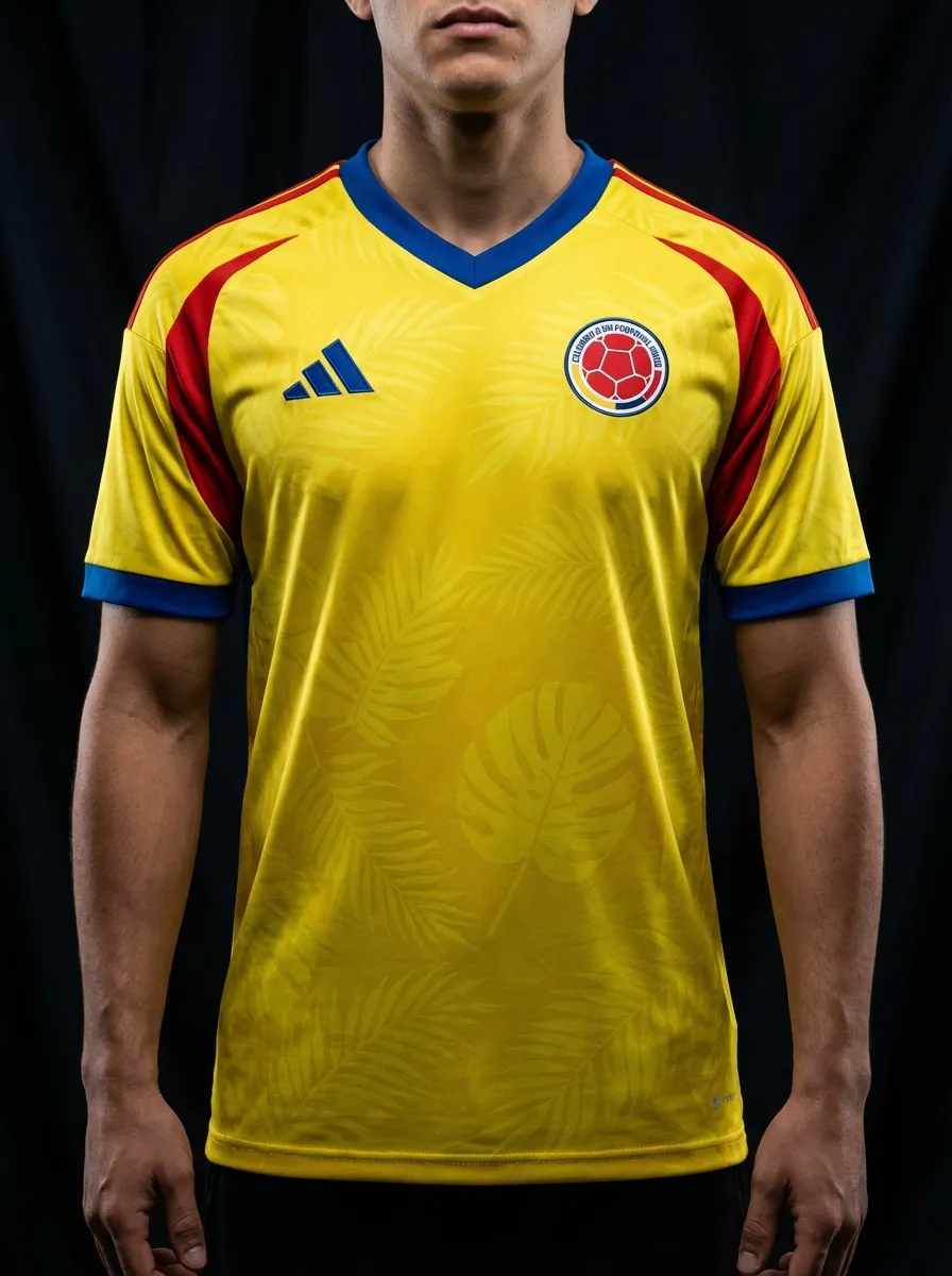
🇨🇴 Colombia
Adidas · Official
Head-to-head kit battle
Adidas · Official
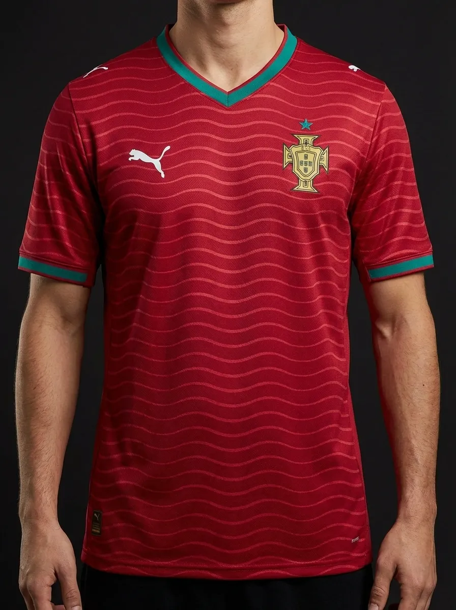
Puma · Official
⚡ Quick Verdict
Colombia against Portugal is a lovely late-group contrast: Adidas yellow with blue energy against Puma’s red-and-green Portugal shirt. Colombia are brighter and more playful, while Portugal land as one of the sleekest red shirts in the tournament.
This is not a historic rivalry, but it feels like a round-of-16 preview because both teams tend to arrive with expectation and plenty of flair.
Vote this matchup
Stored locally on this device.
Share this
Real team data pulled from the current 2026 dataset.
| Category | 🇨🇴 Colombia | 🇵🇹 Portugal |
|---|---|---|
| Brand | Adidas | Puma |
| Primary Colour | #f7d117 | Red |
| Away Colour | Blue away strip with yellow notes and a sleek modern finish. | Green |
| Group | K | K |
| Kit Status | Official | Official |
| Star Players | Luis Díaz, James Rodriguez, Jhon Arias | Cristiano Ronaldo, Bruno Fernandes, Rafael Leao |
| Home Kit Notes | Bright yellow home shirt with blue-red trim and unmistakable Colombian flair. | Classic Portugal red with green trim and a premium modern cut. |
🏛️ Most Classic
Colombia’s yellow home identity feels more singular and immediately national than Portugal’s darker red execution.
Explore Colombia's kit →🔥 Boldest Design
The bright yellow base simply has more lift and more visual force than Portugal’s controlled crimson.
Explore Colombia's kit →🌍 Best for Neutrals
Portugal offer the better neutral shirt because the darker red palette is easier to wear casually.
Explore Portugal's kit →👕 Everyday Pick
Portugal’s home shirt usually wins the shopping debate thanks to its mix of prestige and everyday wearability.
Explore Portugal's kit →Continue the shirt debate
Load both national shirts into an editable comparison, or use the club finder and Premier League ranking to build the next shortlist from reviewed 2026-27 releases.
Keep comparing
🇵🇹 Portugal vs 🇳🇱 Netherlands
Portugal and the Netherlands offer a Puma-versus-Nike colour battle: Portugal red and green versus the unmistakable Dutch orange. Portugal feel premium and modern, while the Netherlands rely on one of football’s boldest single-colour identities.
🇪🇸 Spain vs 🇵🇹 Portugal
The Iberian derby gives you red against red, but in different tones and different brand languages: Adidas Spain in a deeper La Roja shade with gold details, and Puma Portugal in red with green accents. The fun here is in the nuance, because both kits operate inside a similar national palette but land differently.
🇭🇷 Croatia vs 🇵🇹 Portugal
Croatia against Portugal pairs Nike checks with Puma red and green. Croatia rely on the famous checkerboard, while Portugal combine their national colours with a wavy pattern inspired by the ocean.
🇧🇷 Brazil vs 🇵🇹 Portugal
The two Portuguese-speaking football giants meet in a kit comparison that pits Brazil's iconic Nike yellow against Portugal's Puma red and green — two contrasting national shirt identities.
🇪🇸 Spain vs 🇵🇹 Portugal
The Iberian derby in shirt form. Adidas Spain red against Puma Portugal red — two similar colour families, two different kit philosophies, and a rivalry that predates both manufacturers.
🇵🇹 Portugal vs 🇫🇷 France
Two European heavyweights with different suppliers and visual identities: Portugal's Puma red against France's Nike navy. The Ronaldo-vs-Mbappé era has produced multiple meetings between these sides.