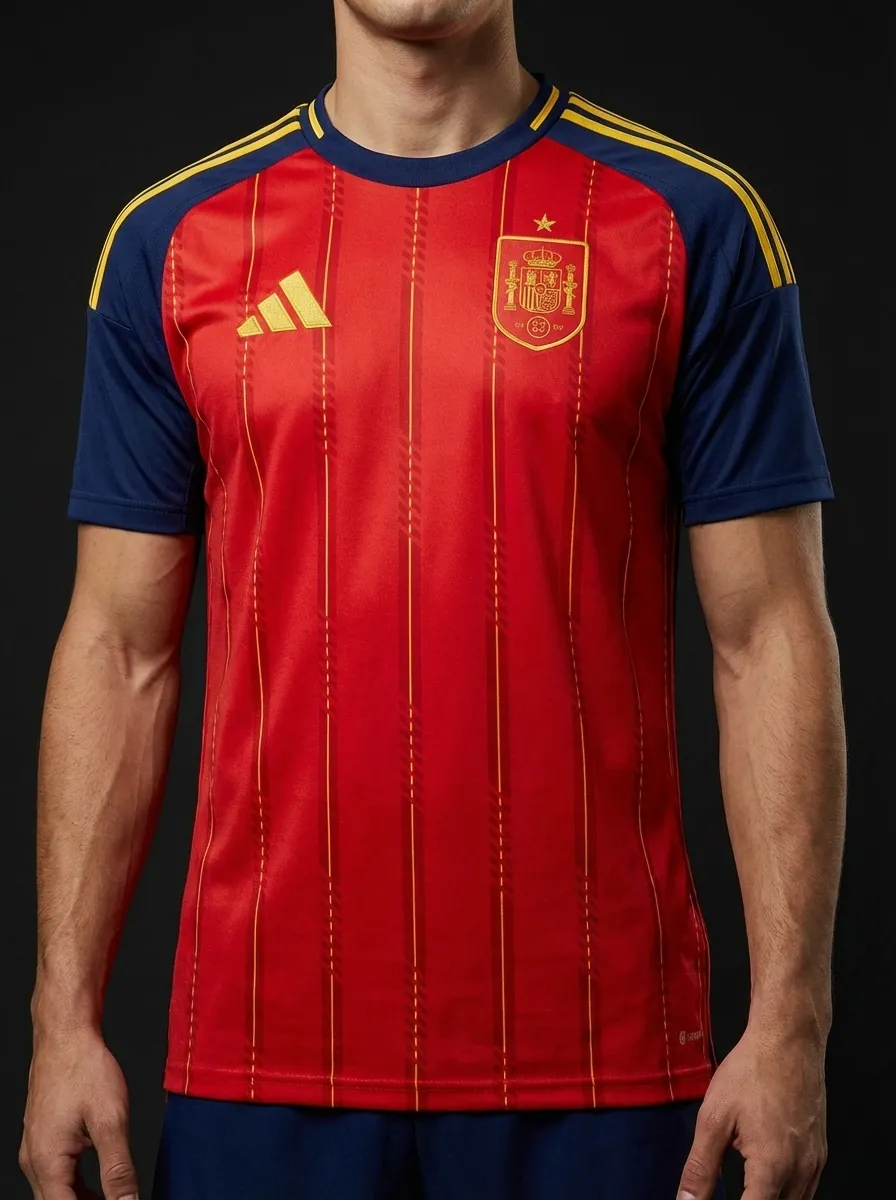
🇪🇸 Spain
Adidas
Head-to-head kit battle
Adidas
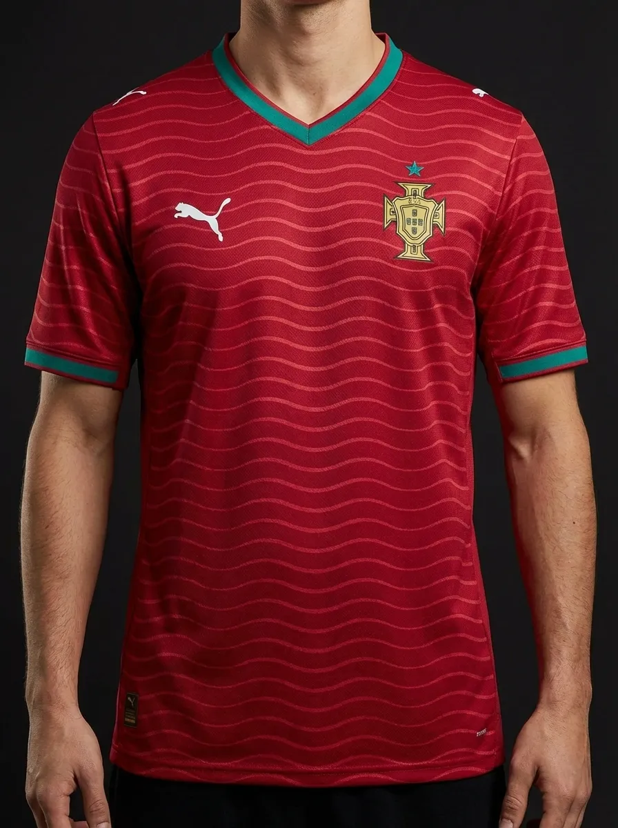
Puma
⚡ Quick Verdict
The Iberian derby gives you red against red, but in different tones and different brand languages: Adidas Spain in a deeper La Roja shade with gold details, and Nike Portugal in a darker crimson with green trim. The fun here is in the nuance, because both kits operate inside a similar national palette but land differently.
Spain and Portugal rarely need extra narrative, with neighbouring identities and regular tournament pressure making the derby feel bigger than most friendlies.
Vote this matchup
Stored locally on this device.
Share this
Real team data pulled from the current 2026 dataset.
| Category | 🇪🇸 Spain | 🇵🇹 Portugal |
|---|---|---|
| Brand | Adidas | Puma |
| Primary Colour | Red | Red |
| Away Colour | Dark | Green |
| Group | H | K |
| Kit Status | Confirmed | Confirmed |
| Star Players | Lamine Yamal, Rodri, Pedri | Cristiano Ronaldo, Bruno Fernandes, Rafael Leao |
| Home Kit Notes | La Roja red with gold detailing and a premium, modern athletic cut. | Classic Portugal red with green trim and a premium modern cut. |
🏛️ Most Classic
Spain’s red-and-gold formula feels closer to the country’s enduring tournament image.
Explore Spain's kit →🔥 Boldest Design
Portugal’s darker red with green trim creates a stronger colour contrast and a more dramatic overall look.
Explore Portugal's kit →🌍 Best for Neutrals
Portugal’s version of red reads as slightly more fashion-friendly for neutrals browsing tournament shirts.
Explore Portugal's kit →🛒 Best Buy
Spain’s home shirt is the safer long-term buy if you want a straightforward classic from a top nation.
Explore Spain's kit →Keep comparing
🇩🇪 Germany vs 🇪🇸 Spain
Adidas face themselves here, but the styles could not be further apart: Germany go with a classic white base and black contrast, while Spain stay true to a deeper red home identity with gold notes. It is a comparison between tournament minimalism and a warmer, more aggressive colour story.
🇵🇹 Portugal vs 🇳🇱 Netherlands
Portugal and the Netherlands give Nike a strong colour-against-colour battle: deep Portugal red and green versus the unmistakable Dutch orange. Portugal feel premium and modern, while the Netherlands rely on one of football’s boldest single-colour identities.
🇫🇷 France vs 🇪🇸 Spain
France and Spain line up a high-end Nike versus Adidas clash in navy and red, freshened by their Euro 2024 semi-final storyline. France look darker and more tailored, while Spain carry a brighter heat through the chest with gold details that keep the shirt feeling tournament-ready.
🇭🇷 Croatia vs 🇵🇹 Portugal
Croatia against Portugal is a Nike-only battle between one of football’s loudest patterns and one of its cleaner premium reds. Croatia rely on the famous checkerboard to do all the talking, while Portugal keep the silhouette simpler and let red-green heritage carry the shirt.
🇺🇾 Uruguay vs 🇪🇸 Spain
Uruguay versus Spain is Adidas against Adidas, but the colour contrast does all the heavy lifting: sky blue against deep red and gold. Uruguay offer one of the calmest classic shirts in the sport, while Spain come in warmer, louder, and more theatrical.
🇨🇴 Colombia vs 🇵🇹 Portugal
Colombia against Portugal is a lovely late-group contrast: Adidas yellow with blue energy against Nike’s darker premium red. Colombia are brighter and more playful, while Portugal land as one of the sleekest deep-red shirts in the tournament.