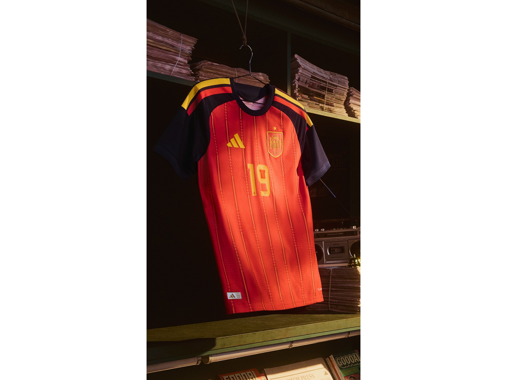
🇪🇸 Spain
Adidas
Head-to-head kit battle
Adidas
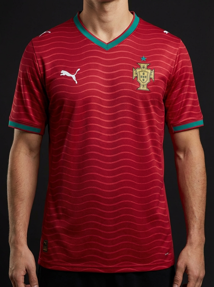
Puma
⚡ Quick Verdict
The Iberian derby in shirt form. Adidas Spain red against Nike Portugal red — two identical colour families, two completely different kit philosophies, and a rivalry that predates both manufacturers.
Spain and Portugal meet as neighbours and share multiple major-tournament fixtures. The 2018 World Cup opener between them produced a Ronaldo hat-trick and is one of the best group-stage matches ever played.
Vote this matchup
Stored locally on this device.
Share this
Real team data pulled from the current 2026 dataset.
| Category | 🇪🇸 Spain | 🇵🇹 Portugal |
|---|---|---|
| Brand | Adidas | Puma |
| Primary Colour | Red | Red |
| Away Colour | Dark | Green |
| Group | H | K |
| Kit Status | Confirmed | Confirmed |
| Star Players | Rodri, Pedri, Lamine Yamal | Bruno Fernandes, Rafael Leao, Bernardo Silva |
| Home Kit Notes | La Roja red with gold detailing and a premium, modern athletic cut. | Classic Portugal red with green trim and a premium modern cut. |
🏛️ Most Classic
Spain red is older and more established as an international kit template.
Explore Spain's kit →🔥 Boldest Design
Nike Portugal typically takes more design risks than Adidas Spain.
Explore Portugal's kit →🌍 Best for Neutrals
Nike's design language wins most neutrals over Adidas's cleaner template.
Explore Portugal's kit →🛒 Best Buy
Spain shirts are slightly easier to find in UK shops at tournament time.
Explore Spain's kit →Keep comparing
🇩🇪 Germany vs 🇪🇸 Spain
Adidas face themselves here, but the styles could not be further apart: Germany go with a classic white base and black contrast, while Spain stay true to a deeper red home identity with gold notes. It is a comparison between tournament minimalism and a warmer, more aggressive colour story.
🇵🇹 Portugal vs 🇳🇱 Netherlands
Portugal and the Netherlands give Nike a strong colour-against-colour battle: deep Portugal red and green versus the unmistakable Dutch orange. Portugal feel premium and modern, while the Netherlands rely on one of football’s boldest single-colour identities.
🇪🇸 Spain vs 🇵🇹 Portugal
The Iberian derby gives you red against red, but in different tones and different brand languages: Adidas Spain in a deeper La Roja shade with gold details, and Nike Portugal in a darker crimson with green trim. The fun here is in the nuance, because both kits operate inside a similar national palette but land differently.
🇫🇷 France vs 🇪🇸 Spain
France and Spain line up a high-end Nike versus Adidas clash in navy and red, freshened by their Euro 2024 semi-final storyline. France look darker and more tailored, while Spain carry a brighter heat through the chest with gold details that keep the shirt feeling tournament-ready.
🇭🇷 Croatia vs 🇵🇹 Portugal
Croatia against Portugal is a Nike-only battle between one of football’s loudest patterns and one of its cleaner premium reds. Croatia rely on the famous checkerboard to do all the talking, while Portugal keep the silhouette simpler and let red-green heritage carry the shirt.
🇺🇾 Uruguay vs 🇪🇸 Spain
Uruguay versus Spain is Adidas against Adidas, but the colour contrast does all the heavy lifting: sky blue against deep red and gold. Uruguay offer one of the calmest classic shirts in the sport, while Spain come in warmer, louder, and more theatrical.